Thursday, 20 December 2012
7th draft front cover
This is an improvement from my previous draft of my front cover and boxes have been added to make things stand out more on the page.
Wednesday, 19 December 2012
6th front cover draft
This is the draft that I like the best because I have added a header,footer, more articles and a three colour scheme.
Tuesday, 18 December 2012
Price
I have looked at three music magazines and will use these to determine the price of my magazine.
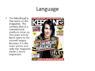
Kerrang costs £2.20 and is published weekly which is a price they have decided on based on what they feel is affordable for their target audience.
Rock Sound is published monthly and costs £4 which works out as just £1 a week.
Classic Rock is published once a month and costs £5.50 per issue which is £1.37 per week which is more expensive than Rock Sound but is aimed at a different target audience within the rock genre.
I have decided that my price will be £2.50 and it will be published bi-weekly
Monday, 17 December 2012
Friday, 14 December 2012
Screenshots 1st draft
From the top left to bottom right i created my first draft of my front cover. Top left image is the background. Just below is background with image added. Next I added the masthead, then 1st article and the next two images are another article and the price.Next was the Issue No. Then came a description of the main feature and finally came the headline of the main feature
1st Draft front cover
I don't like how little space there is for articles and will change this for my next draft and my masthead is small
Thursday, 13 December 2012
Tuesday, 11 December 2012
Kerrang Top 40 24th November 2012
01. Castle Of Glass - Linkin Park (-)
02. Stray Heart - Green Day (up 2)
03. Unity - Shinedown (-)
04. Madness - Muse (down 2)
05. Here Comes My Man - The Gaslight Anthem (up 1)
06. Reckless - You Me At Six (down 1)
07. Temper Temper - Bullet For My Valentine (NEW)
08. Stingin' Belle - Biffy Clyro (up 3)
09. Burn It Down - Linkin Park (down 1)
10. Higher And Higher - The Blackout (RE-ENTRY)
11. Trying Not To Love You - Nickelback (up 2)
12. We Bring An Arsenal - Lostprophets (RE-ENTRY)
13. Days Go By - The Offspring (up 2)
14. For Baltimore - All Time Low (NEW)
15. Loverboy - You Me At Six (RE-ENTRY)
16. Jesus Walks - Lostprophets (up 1)
17. Save The Nation - Royal Republic (NEW)
18. Rize Of The Fenix - Tenacious D (down 10)
19. What Could Have Been Love - Aerosmith (NEW)
20. Surprise Surprise - Billy Talent (down 11)
This is a top 40 from Kerrang which is based on airplay across Kerrang! Radio, Kerrang! TV and actual chart sales complied exclusively by The Official Charts Company.
Thursday, 29 November 2012
Friday, 9 November 2012
Thursday, 8 November 2012
Uses and Gratification theory
Uses and gratification Theory
Uses and
gratification theory states what people do with media rather than what media
does to people. In other words what needs do people use media for. There are
several types of needs which people use media for;
- Cognitive needs
- Affective needs
- Personal Integrative needs
- Social Integrative needs
- Tension free needs
Cognitive
needs
People use media
for acquiring knowledge, information etc., Among the audience some of them have
intellectual needs to acquire knowledge this is not common to all only certain
people have their need, each person have a different need for e.g. quiz
programs on TV, in order to acquire knowledge and information you will watch
news to satisfy the need, search engines in the internet, they make use of these
to gain more knowledge. Particularly for the internet search engine they can
browse for any topic under the run with no time restriction.
Affective
needs
Affective needs include all
kinds of emotions, pleasure and other moods of people. People use media like
television to satisfy their emotional needs.Personal Integrative needs
This is when people use TV to make themselves feel better/ gain self-esteem. This makes people want to change themselves and give them motivation to change. Adverts are one way in which people fulfill these needs.
Social Integrative Needs
This is the need people have to communicate with family and friends people use the media in this way by using social networking sites such as Facebook etc. Another way is watching a TV program because your friends watch it so you have something to talk about.
Tension free needs
This is when people use the media to relax although some may watch a film while others may listen to the radio because the way in which people fulfill this need is individual to them because people are not all the same.
Information from http://communicationtheory.org/uses-and-gratification-theory/
Tuesday, 6 November 2012
Reader Profile
Reader
profile
The Kerrang! reader.
Gender Ratio
41%59%
ABC1 profile
49.8%
Age Range
|
15-24
|
25-34
|
35-44
|
45-54
|
55-64
|
65+
|
|
6965.9%
|
12.8%
|
9.3%
|
6.3%
|
1.6%
|
0.5%
|
Source: NRS July 2011 - June 2012
This shows that KERRANG! Is mainly bought by men
with women slowly catching up to men with a 1% increase since 2006 to 2012. Men
aged 15-24 are the demographic that KERRANG! Is bough by and in the older
reader profile it tells you the lifestyle of people in this demographic and
something related to KERRANG! In that it says that on average a reader of this
magazine will buy 31 albums a year. It also mentions that readers enjoy
computer games, media and fashion also it mentions that modern youth are media
savvy. The adult circulation number from 2006 is 85,377 the median age of a
reader of KERRANG! Is 19 years old. It says the 15-24 year old readers are
sharp, intelligent and rejoice in their individuality. It describes itself as a
world where Jackass meets PlayStation and skate culture meets iPod. Between July 2011 and June 2012 the amount of
people who bought KERRANG! That are aged between 15 and 24 was 65.9%
representing clearly the target audience of KERRANG! With the closest number to
that is the 12.8% of 25-34 year olds that bought KERRANG! In that time period.
Not surprisingly the over 65’s are the people that are statistically less
likely to buy this magazine as only 0.5% of the KERRANG! readership is compose
of people within this age group because traditionally this is not the genre of
music that older people tend to listen to.
Thursday, 25 October 2012
Thursday, 18 October 2012
Evaluation
Evaluation
(Preliminary Task)
I chose the name College Weekly because it comes out every week. I chose blue for my text because blue connotes cool which implies that this magazine is cool which is a message I want to give the reader which would help persuade them to buy the magazine.
I chose to use the image as my background because it
shows part of the college so that it helps the title establish that it is a
college magazine. The background is a college corridor which is the first place
you encounter when you walk into college and is a communal space within the
college. I included the barcode because it is a convention of a magazine
because the barcode is what is scanned to determine the price in the shop.
Issue number and price are listed near the masthead
because this is what you would see if you could only see the top of a magazine
due to how they are shelved in shops. The issue number lets you know how many
times the magazine has been issued but not all magazines have an issue number
on the front. The price is so that if somebody wanted to buy this magazine they
would know how much it costs which helps determine if people buy magazines.
I chose blue for my text colour because blue
connotes cool and calm because at college you can be cool and calm this is also
what some of the articles can help with such as organisation tips. Also it
stands out well from the background which makes it look important.
I chose to feature a letter from the principal
because he is important but he is welcoming new students to the college which
makes them feel more settled. This helps progress because if someone is settled
then they can put all their effort into their work.
My masthead dominates the top of the page because of
the way that magazines are organized in shops to be sold so the masthead is
very important and needs to be bigger than any of the other text on the cover
of the magazine. The image shows that there is a lot behind the model meaning
that they are achieving highly and have things behind them they have not been
overtaken by a heavy work load.
If I could repeat this task then I would take the
images earlier and think of more interesting articles to include on the front
cover, I would also have made my masthead a different colour to make it stand
out further from the articles. If I did this then I would have been able to get
more time to tweak my cover on Photoshop which would have made it better and I would
then have more time to complete other areas of this task which would have been
easier than the cover but because I didn't have a clear idea in my head of how I
wanted it to look it took more time than it should of.
Coursework Brief
To design a front cover, contents page and double page spread of a new music magazine. All images and text used must be original a minimum of four images must be used
Tuesday, 16 October 2012
Monday, 15 October 2012
Thursday, 11 October 2012
Subscribe to:
Comments (Atom)


